WESTVILLESELECTED WORK
OCTOBER NEWSLETTER & WEB EXPERIENCE
The project
Westville’s October issue connects a practical guide to balanced meals with a neighborhood fundraiser and a regular’s story—across a designed email and a companion editorial webpage.
What I did
I brought the content, visual design and digital build together: shaping the email’s reading order, preparing the linked artwork for Olo, and translating the issue into a longer web experience.
The finished email and webpage
The email gives each story a concise introduction and a clear next step. The companion page carries Gabrielle’s full guide, supporting sources, the Chemo Comfort feature and Emily’s story. Cream backgrounds, green headings and familiar Westville imagery connect the two formats.
Creating the plate GIF
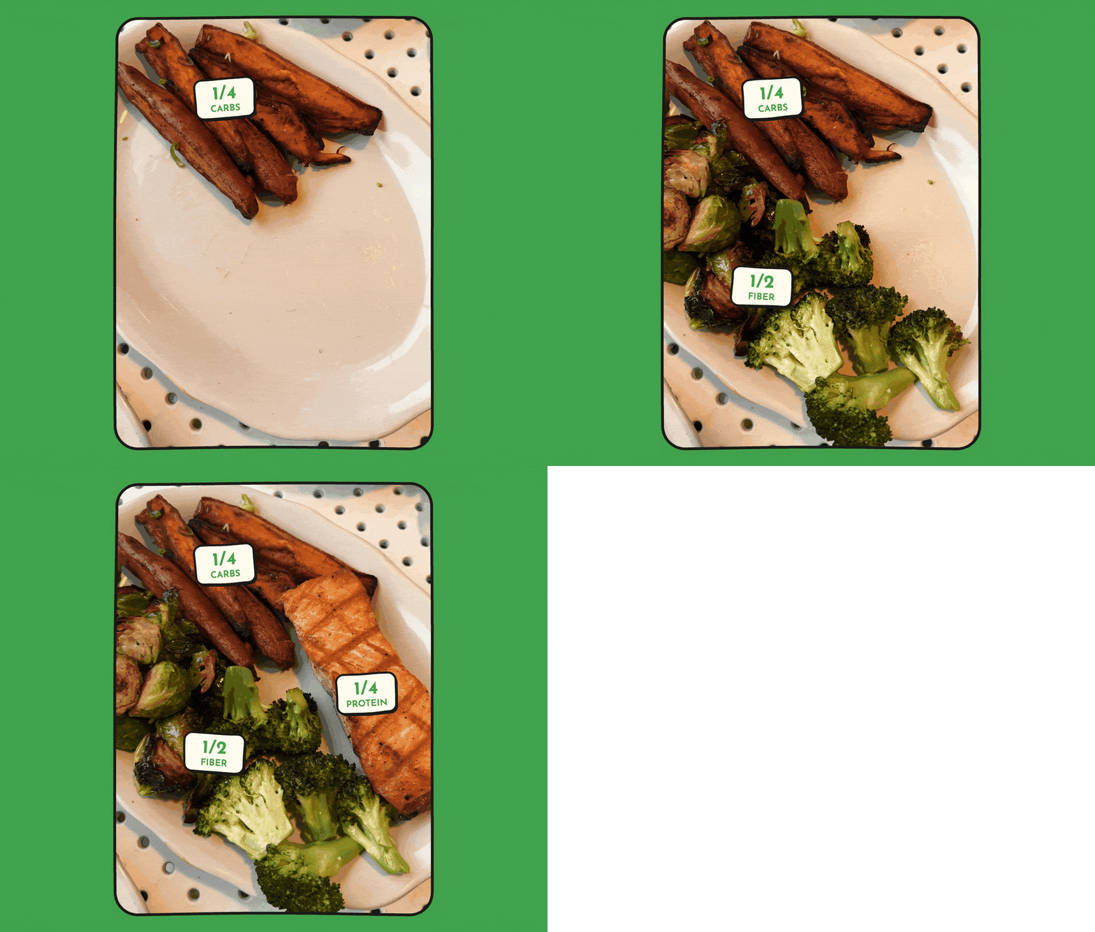
Combining photos and illustrations
I created a GIF from the photos Gabrielle supplied, then layered illustrations over it to label the portions of the meal.
The finished GIF appears in the “Make it your own at Westville” section of the email.
Giving each story a clear role
The issue moves from practical advice to the neighborhood around Westville, then closes with the voice of a longtime guest.
Gabrielle’s guide
A visual summary makes the expert contribution easy to scan. The full guide, biography and sources live on the webpage, with clear links back to Gabrielle.
Chemo Comfort
The community section explains the organization before introducing Cocktails for Comfort. Dates and the Hudson-only location keep the fundraiser’s details specific.
Meet Emily
Personal photographs and excerpts from Emily’s story bring the issue back to everyday visits, favorite meals and the Russell the Brussel mascot.
Building the email for Olo
I organized the design into individually linked sections so readers could continue to the newsletter, browse the menu or visit Gabrielle’s profile. The final export contains 25 linked image sections, including the plate GIF, followed by a live-text footer.
The image descriptions carry meaningful summaries of the artwork, while the footer keeps locations, ordering, the menu, catering and unsubscribe information as text links. The layout scales from a 675px email canvas to a single column on smaller screens.
Making room for the complete issue
The webpage opens with an “In this issue” menu for the balanced-plate guide, Chemo Comfort and Emily. Longer sections use headings, photographs, pull quotes and source links to break up the reading.
On desktop, selected visual elements stay in place as the reader scrolls. The live page preserves that behavior and the plate GIF; a full-page capture provides an overview of the content.
VIEW LIVE EXPERIENCE →A connected October issue
The finished work brings expert advice, community participation and a customer story into one consistent email and web experience, with a relevant destination for each feature.
Nutrition contribution: Gabrielle Kishner, MS, RD, CDN. Guest story and photographs: Emily. Community feature: Chemo Comfort, with the testimonial attributed to Judith Dobrof and Cancer Support Team.